
Mods / Lay of the Land
Author: fibojoly
Side: Client
Created: Nov 7th 2022 at 10:52 AM
Last modified: Nov 7th 2022 at 11:05 AM
Downloads: 3045
Follow Unfollow 62
Latest file for Various v1.17.x:
LayOfTheLand_1.0.zip
1-click install
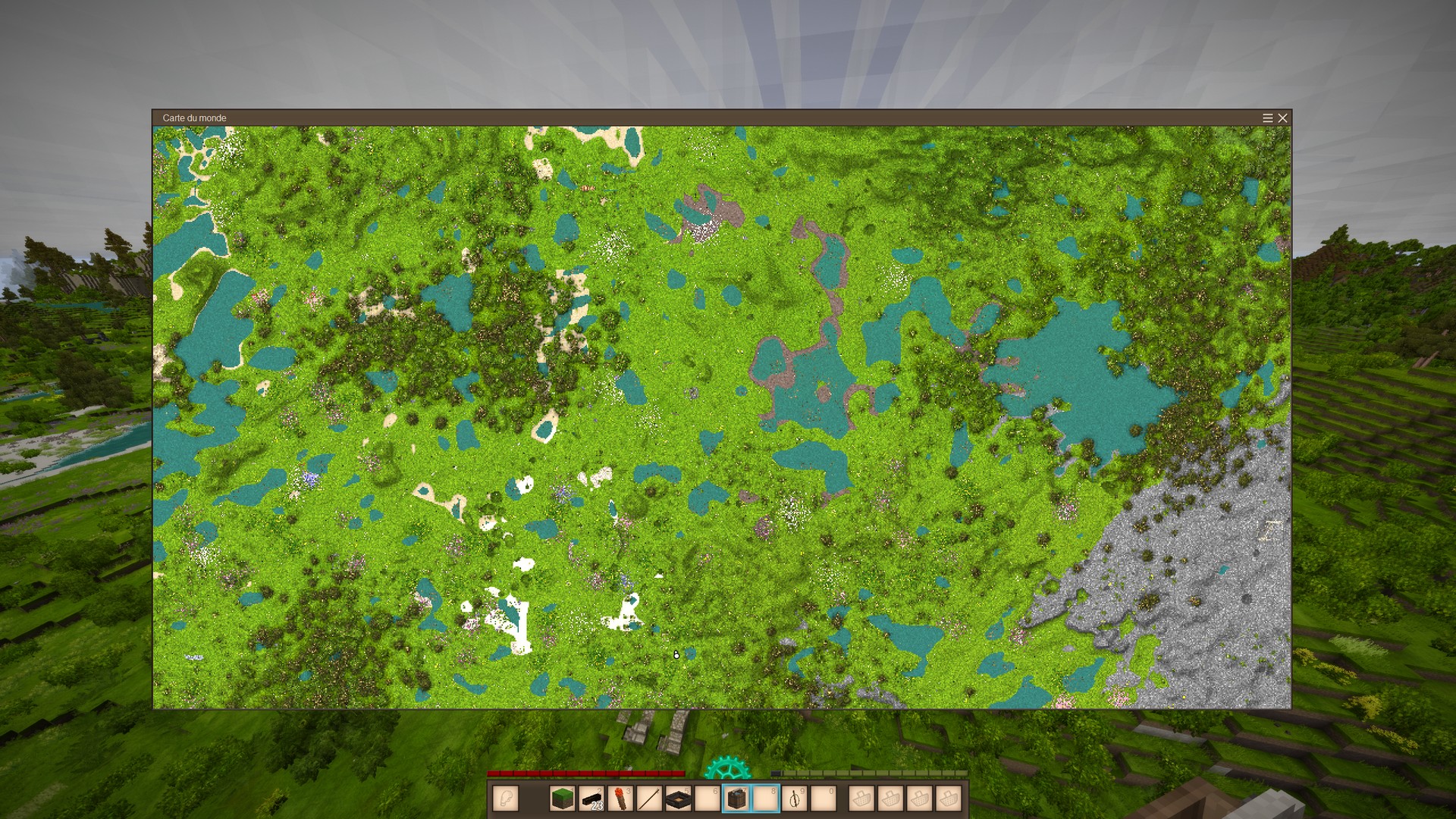
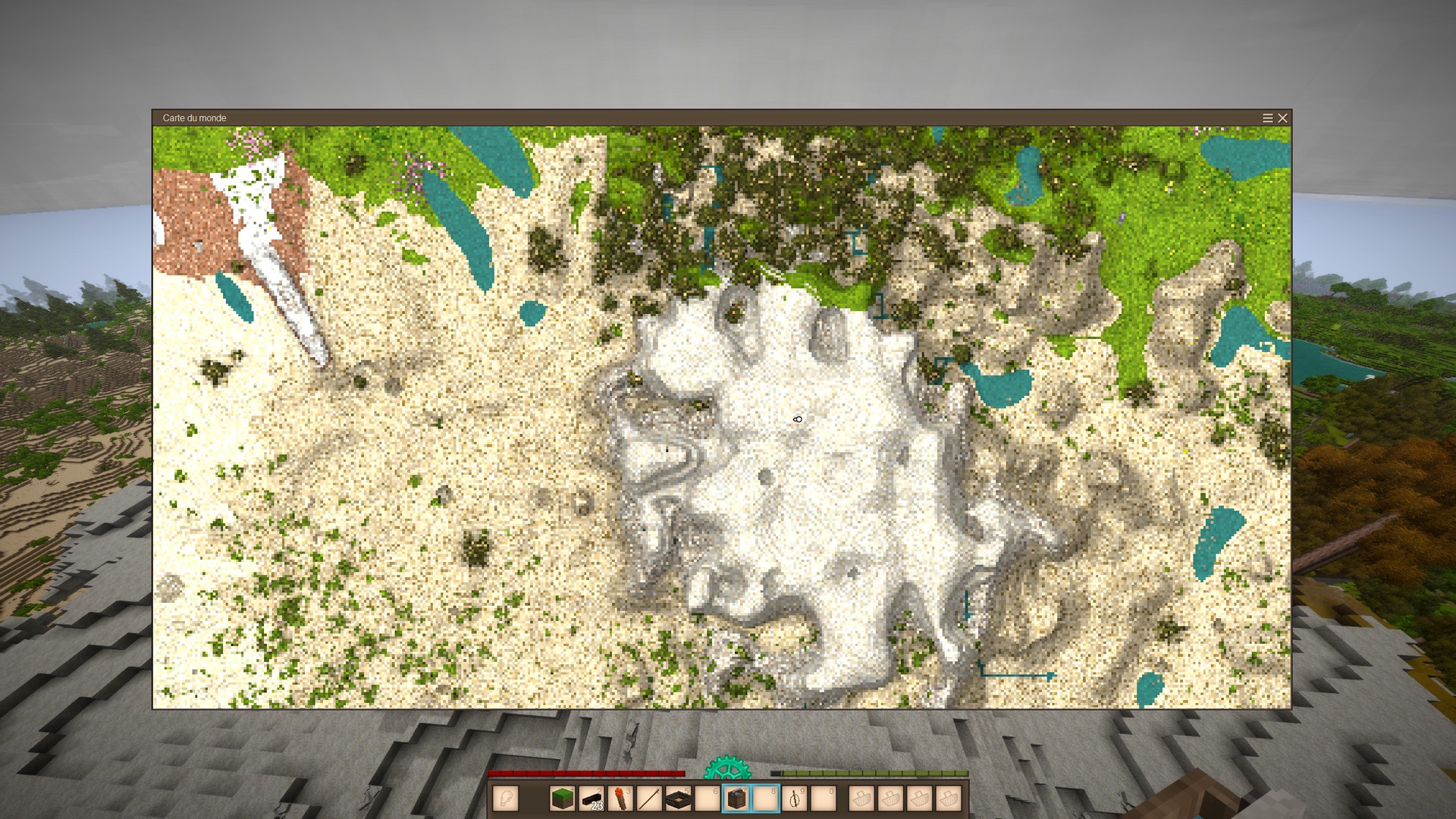
This small client side mod was written after getting lost in the mountains one time too many and wanting a way to actually find my way out.
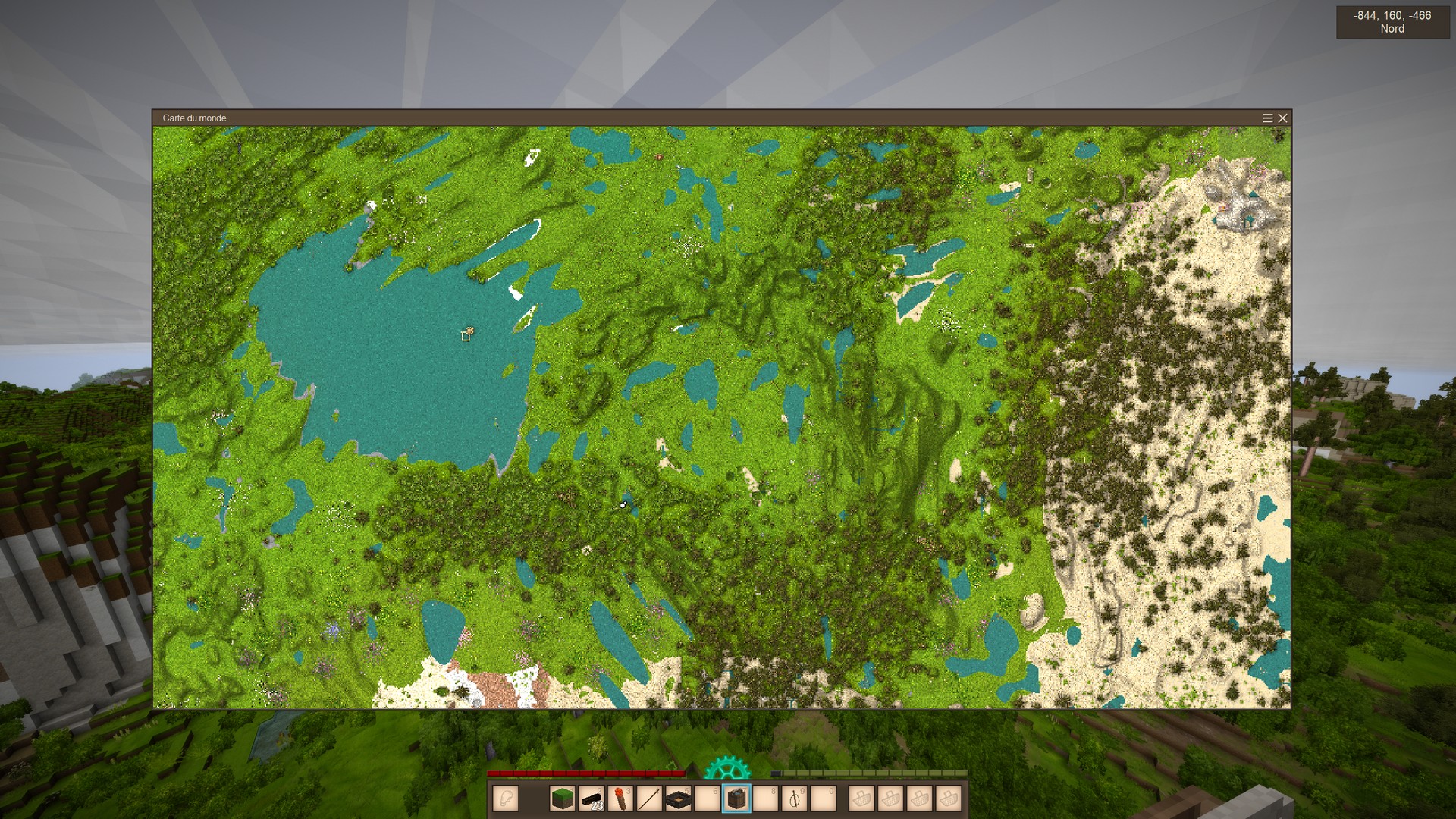
It uses a simple normal map, some super primitive ambient occlusion and some other tricks to emphasize cliffs, darken holes and smooth out shallow slopes.
It might become obsolete with the release of 1.18 but you know what ? I wanted to release it because it's my first mod ever and I'm kinda proud it inspired Tyron to go ahead and fix the map. And perhaps I have a few tricks of my sleeve, yet :)
Note that the map doesn't use climate/season tinting, to reduce the visual difference between old and recently visited chunks.
The screenshots were taken using the .worldmapsize command that lets you increase the size of the map display. The area of the map that's revealed, on the other hand, is dependent on your game settings (the max chunk distance).
The algorithm I use is a bit slower than the normal one, so you'll definitely see the map take some time updating itself. If you install this on an existing world, I suggest you use the command .map redraw to avoid ugly inconsistencies.
Known issues
- It's not lightning fast.
- No see-through for transparent blocks such as glass or water.
- Still some tinting : unbeknownst to me, the noise added to colours was actually tinted.
| Version | For Game version | Downloads | Release date | Changelog | Download | 1-click mod install* |
|---|---|---|---|---|---|---|
| v1.0.0 | 3045 | Nov 7th 2022 at 11:05 AM | Show | LayOfTheLand_1.0.zip | Install now |

This mod doesn’t appear to work any longer at least on the public server side. I would like to see this mod updated if possible, I found it very useful and easier on the eyes.
Works on 1.18.10? If don't, pls fix it, it's an amazing mod
i like it fibojoly
I like this a lot. Keep up the awesome work.
The biggest tradeoff in this mod for being able to see height properly in the map is the fact that it alters the colors enough so that it's harder to identify different terrain on it (i.e. Clay, peat, terra preta...)
Now that I have gotten used to this thing I’m super impressed. The map looks a tun better, and I love how bright it is. That alone makes seeing detail much easier for old eyes like mine. It does load slower but that is not always bad. Like when I’m trying to find a certain way point on the map it is easier to see before the map loads in.
znatik : that was the idea, thank you :)
mendall : it was indeed a tradeoff, but I hope to improve things once I know how to deal with GUI and I find an elegant solution for handling seasonal colors.
EiraValkyrie : thanks for the feedback on glass, I'll have to keep it in mind. Not sure what's feasible at this point, but I'll definitely look at it.
Amazing. You saved me. I hate mountains. Now you don’t have to climb on them. You can clearly see what is where. All great good luck to you.
ok I get it now I see the contrast in the shape of the mountains in your screen shot and I agree this is a lot more useful for traveling however it is a trade off. You are sacrificing the seasonal info that might have its uses as well. might be nice to have a button on the map to switch between the two modes .
I love most of the changes here, particularly no seasonal ones. But I noticed that glass seems to show as pure blinding white on the map. Edit: Would it be possible to make the map treat glass like it's air? So my greenhouses look slightly prettier on it.
Yes, without the seasonal and climatic tint, the colors are much brighter, as can be seen in the screenshots.
But this is also a choice, because my goal here is to make the map more legible. That means stronger shadows, which means if I kept the original light levels, everything would be too dark very quickly.
It's not perfect, and I'm not too happy with snow, for example. But I feel it's an improvement over the original.
Cool Idea but the brightness on the world map is way too bright.
This only affects the world map view indeed.
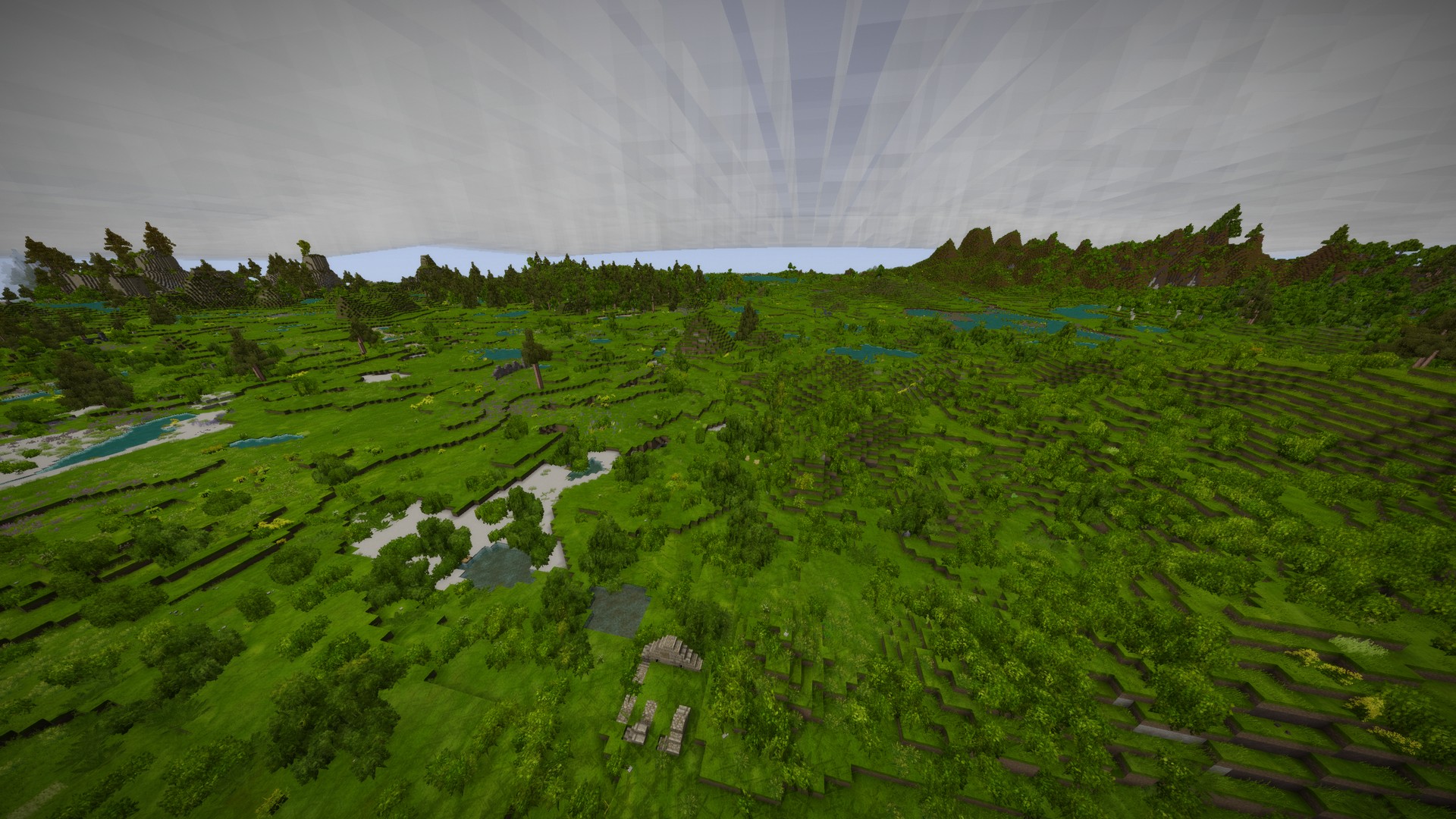
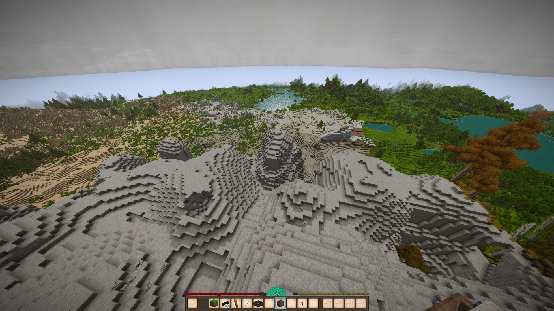
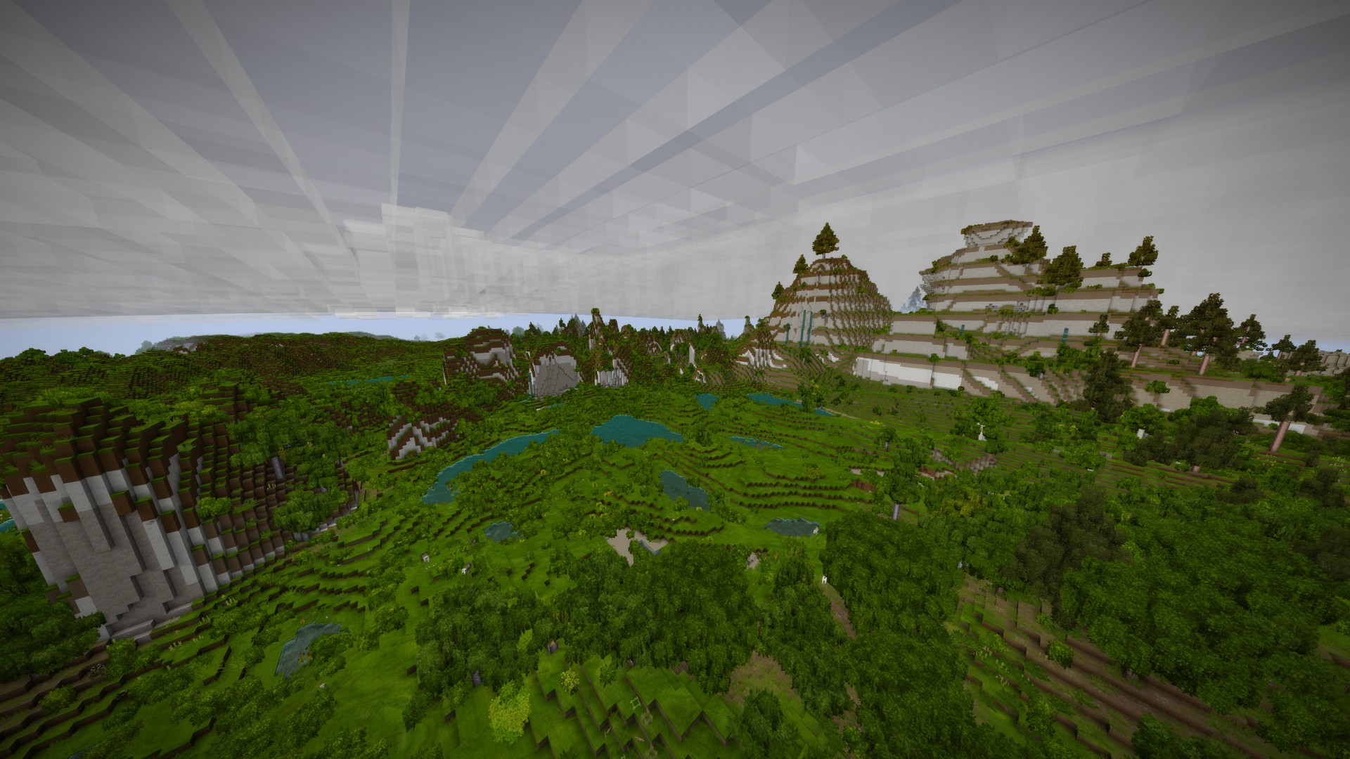
The screenshots are there to show you what the landscape look like and what you get on the map. I.e. how features are clearly visible.
Probably should've done a "before/after" comparison, too. Sorry !
I’m a bit confused does this affect just the world map view.
or the terrain generation itself.